- Aug 29
Fall in Love with Color
- Debbie Hipp
- 0 comments
As the seasons shift and the air turns crisp, it’s the perfect time to infuse your floral paintings with the rich, glowing colors of fall. Think of golden leaves, burnt orange pumpkins, deep crimson mums, and earthy green stems—all those warm tones that make autumn feel so cozy and vibrant. Working with fall colors can feel intimidating at first, but with just a few key pigments and simple mixing formulas, you can create an entire autumn palette that glows on your canvas.
My Go-To Fall Palette
You don’t need dozens of new paints—just build on your basics. Here are some starter pigments that work beautifully for fall tones:
Cadmium Yellow Medium or Indian Yellow – a warm base for golds and oranges
Cadmium Red Light or Pyrrole Red – rich, vibrant reds
Alizarin Crimson - for mixing darker greens and reds
Transparent Red Iron Oxide, or Burnt Sienna or Burnt Umber – earthy browns Ultramarine Blue** – perfect for deepening and neutralizing warm tones
Sap Green and Green Gold – for foliage and stems
Easy Color Mixing Recipes
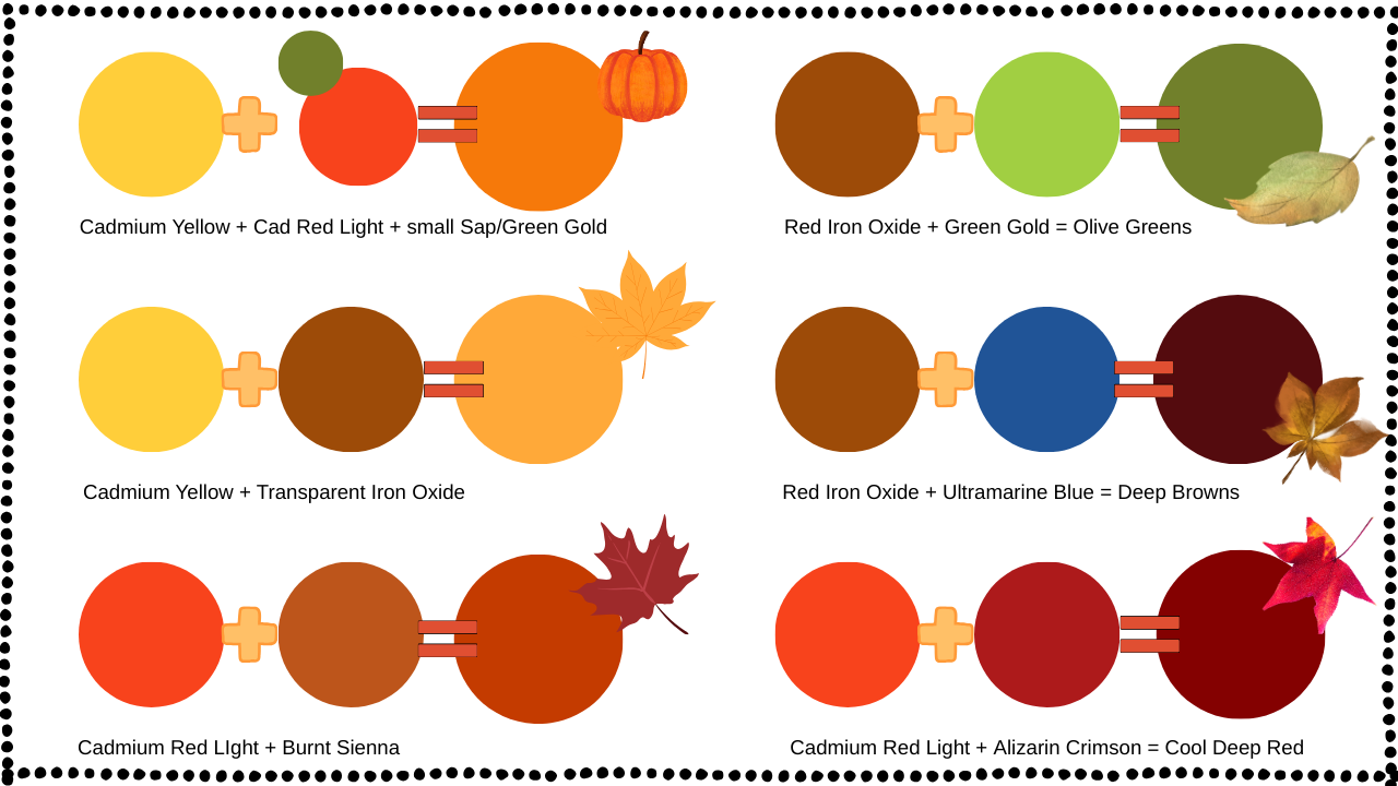
Try these quick formulas to start building your fall palette:
Pumpkin Orange: Cadmium Yellow + a touch of Cadmium Red Light and Sap Green/Green
Gold Golden Yellow: Cadmium Yellow + Burnt Sienna or Transparent Red Iron Oxide (just a pinch)
Rusty Red: Cadmium Red Light or Pyrrole Red + Burnt Sienna Warm Olive Green: Sap Green or Green Gold(lighter version) + a bit of Red Iron Oxide
Deep Autumn Brown: Burnt Umber or Transparent Red Iron Oxide + a touch of Ultramarine Blue